STATIONARY, INVITATIONS, HOLIDAY CARDS
@ExplosiveControlArt
This includes a wide variety of styles of cards I designed both prior to the advent of home computers and photoshop, and after.
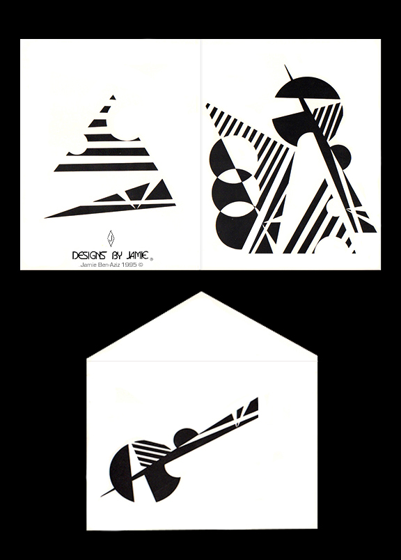
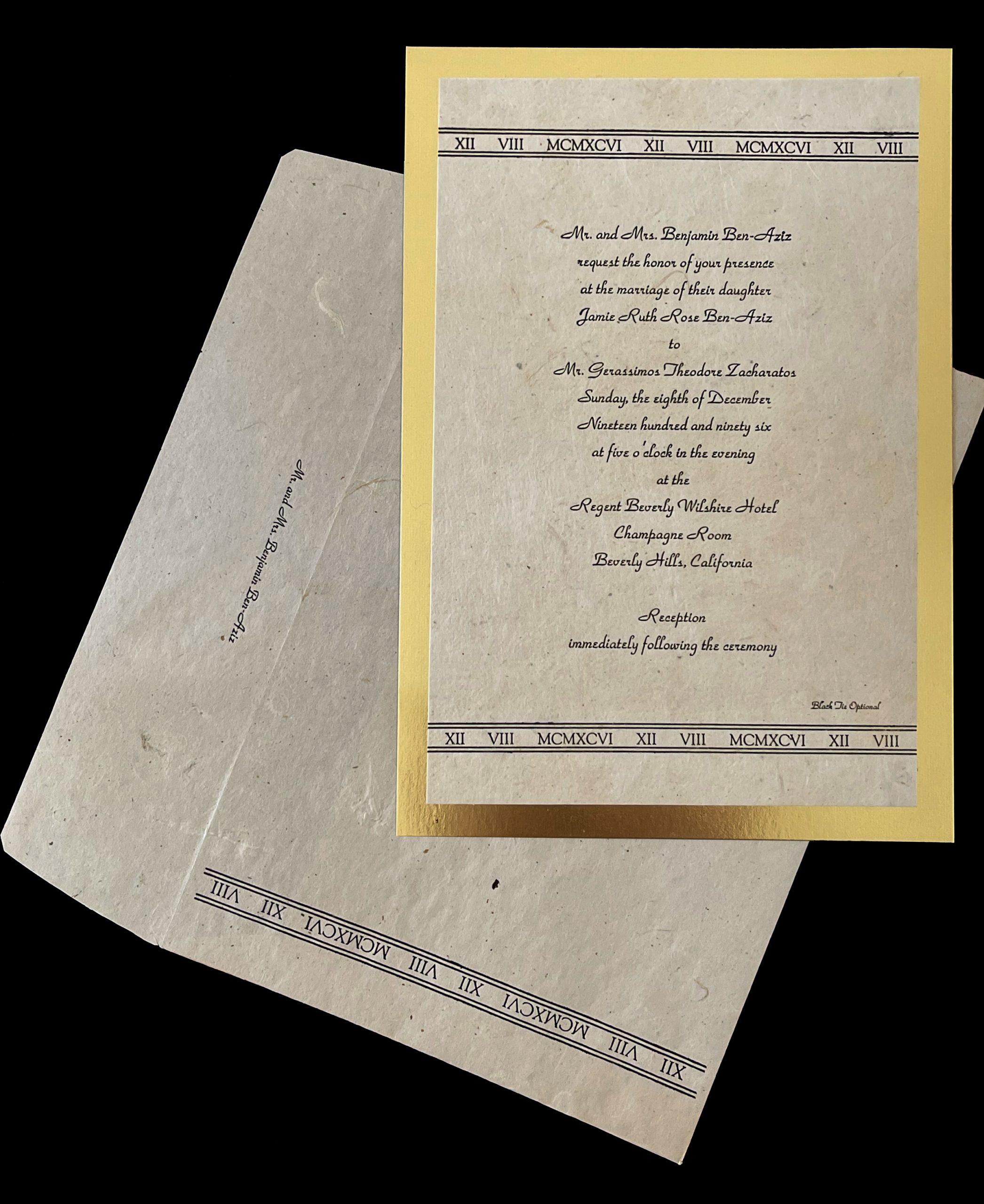
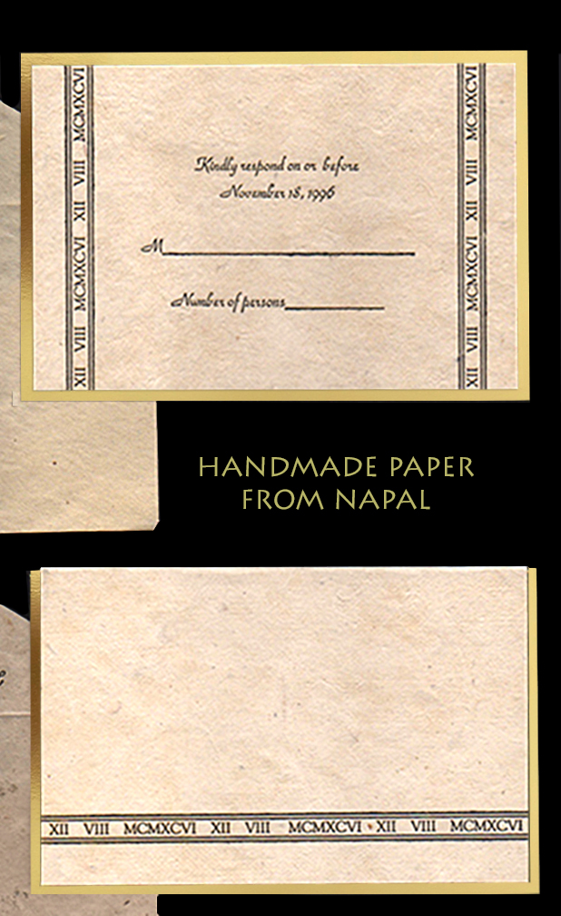
The First group are all hand designed and hand drawn, and were printed at printing press. Some designs are foil embossed, one is on handmade paper from Nepal that is too thick to go through a copier or standard printing press. I had to separate each color for the printer on a separate page, with registration marks to line up.
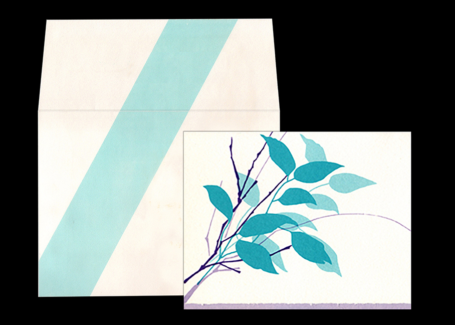
My card designs usually extends to the envelope as well for a unique dramatic finished product that really stands out.
Once the advent of photoshop and copy centers, I rely more on photography and creative montages. It’s inexpensive to print with no minimums and no tedious separating colors for the printer, but the old fashioned way, also has a very unique and special look that can’t be created in photoshop or a copy machine. Great to have options!
I designed a more painterly Bat mitzvah invitation, with a leaf pattern. At a printing press, each color adds an additional cost, so I found a creative way to make this 2 color card look like 4 colors. The printer used a screen, to make each of the 2 colors at a lesser opacity (of the same color), making a new lighter version of the original color. I had to separate each color for the printer. (I also made enclosures and RSVP inserts, but it had personal information of names and addresses etc, so I didn’t include it here)
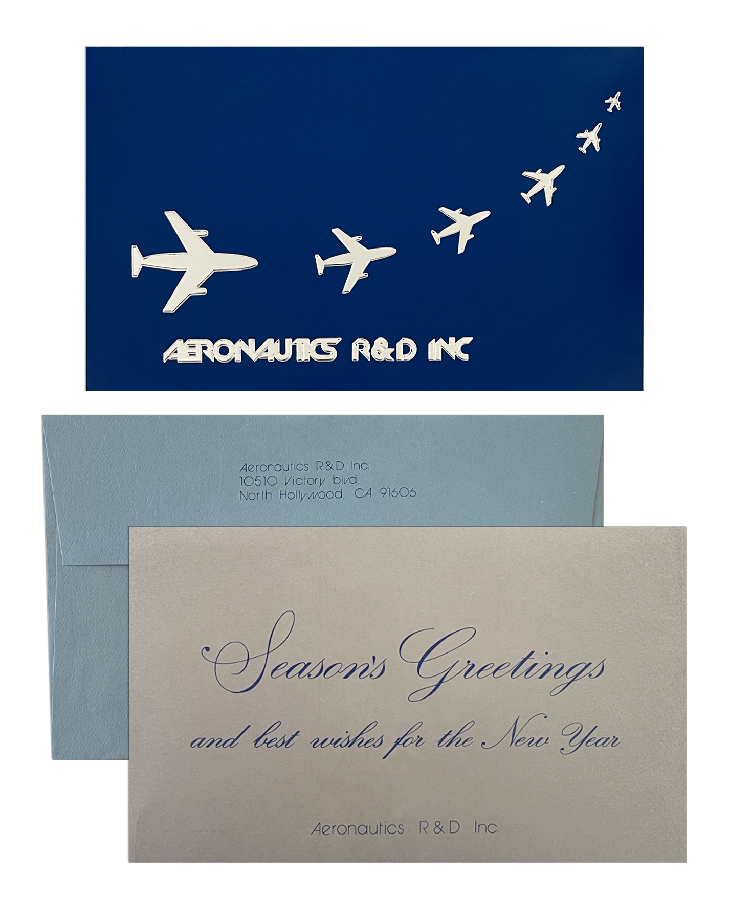
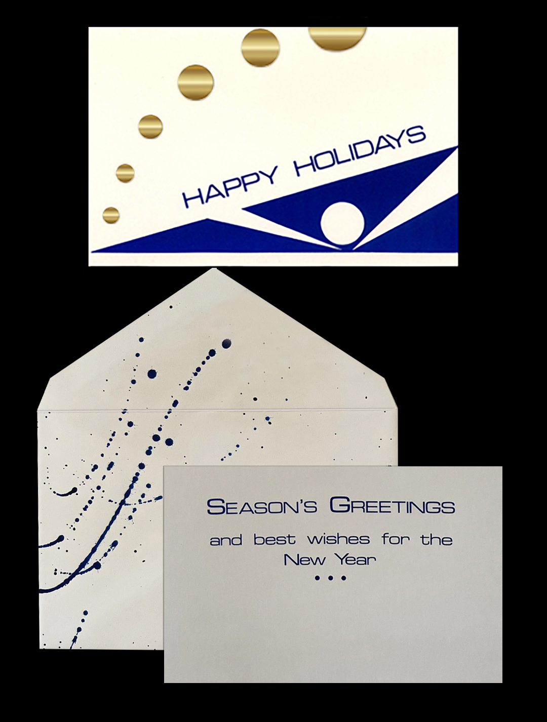
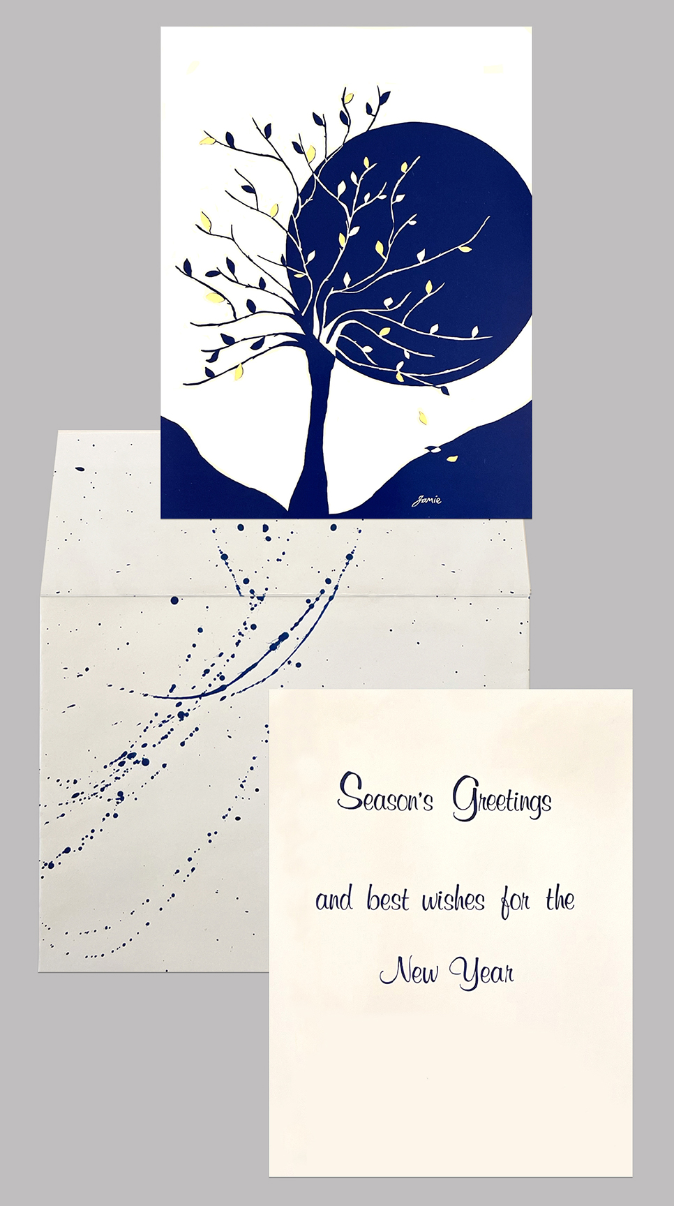
I designed three holiday cards for ARD Inc., an aeronautical research and design co. I wanted the designs to be modern and sleek. One card was more literal with airplanes flying off into the distance. Then one card was a more abstract design, but to still evoke feeling of airiness and flight, then a slight departure to a winter tree for the last card. All 3 cards were blue white with metallic foil printed and embossed on the cards.
I designed an invitation to an “Art to wear & more” show by the Los Angeles Arts Council 1988. I used lace fabric to create a modern sparse design. The design was carried over to the front of the envelope as well, as did the RSVP inserts, which contained personal addresses so I didn’t include it here. Proceeds went to the LAAC Art Scholarship Award Fund.
I designed a very modern graphic card, that is a departure from my usual style, I was inspired by these modern white homes I was seeing built. (not my taste as a home, but still an inspiration)
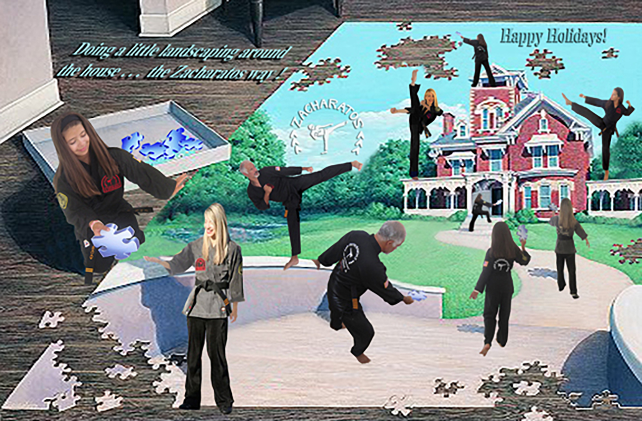
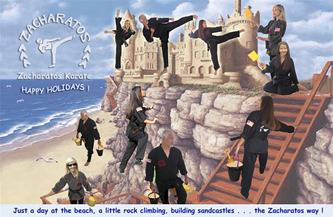
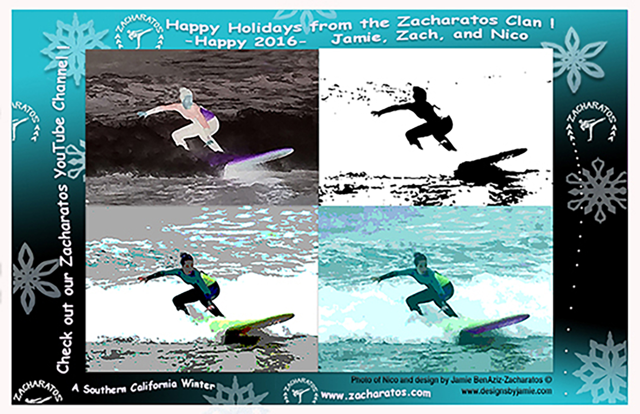
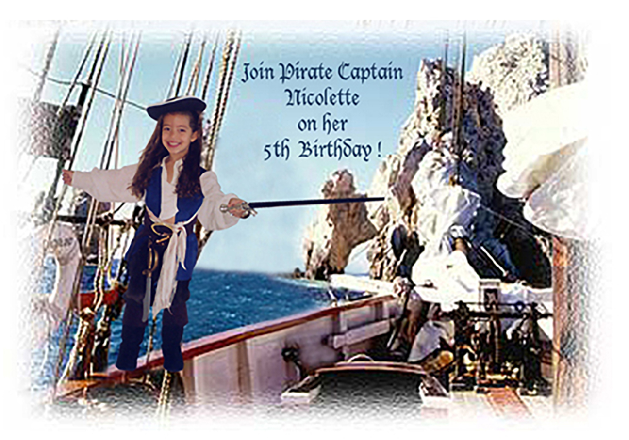
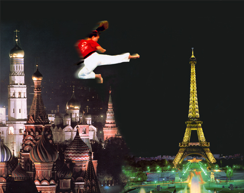
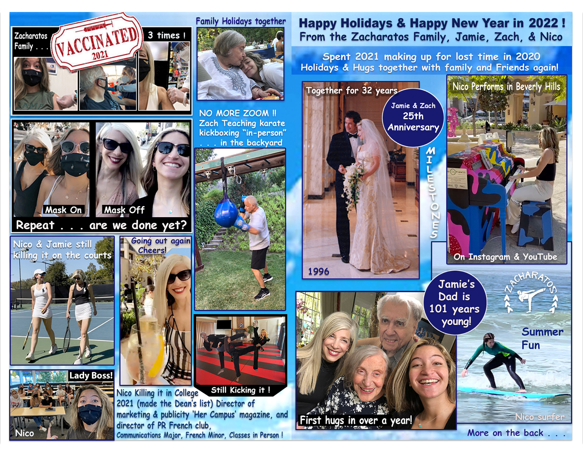
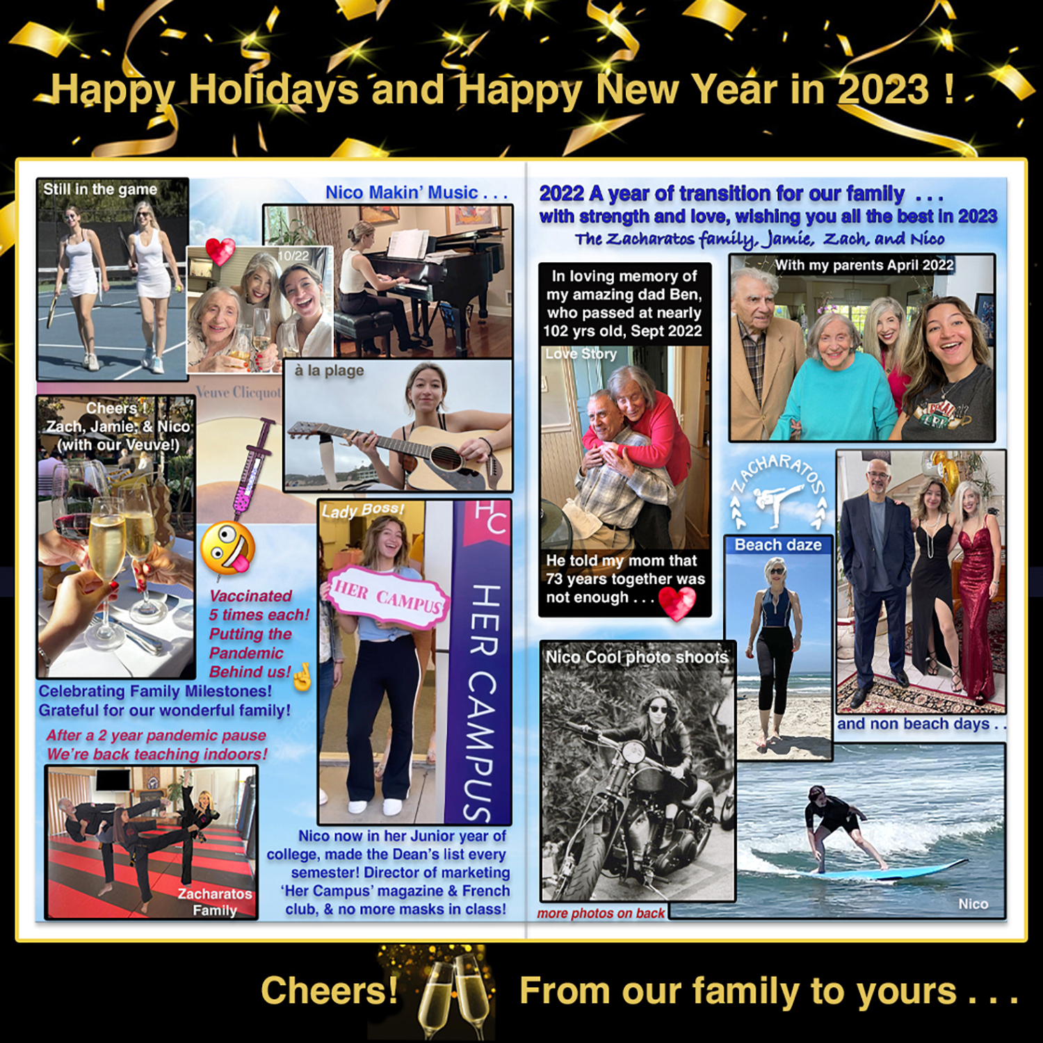
Then, home computers and photoshop happened! This changed the way I made cards. The remainder of the cards shown here, show some of the fun invitations and holiday cards I made for our family and our martial arts studio, by photoshopping images of us in interesting paintings, cards and posters! No need to separate colors for printers, no more minimum printer orders, it has a completely different look and feel.
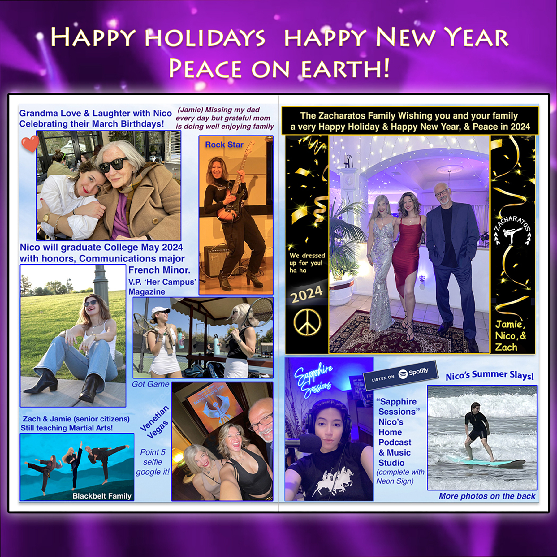
Our 2023-24 Holiday card was another family montage, to place our card to not get cut off on instagram, it needs to be a 7 x 7 square (150 dpi), but instead of placing it in a black square background as I did for 2022, I used some lighting that was from a concert we were at, but the lights were red which didn’t go with my card. In Color Balance in photoshop was very easy to change the color to a more purple color to fit the card. Our Karate students are used to seeing us in our karate uniforms, so it’s always fun to get a bit glam for the holiday card!
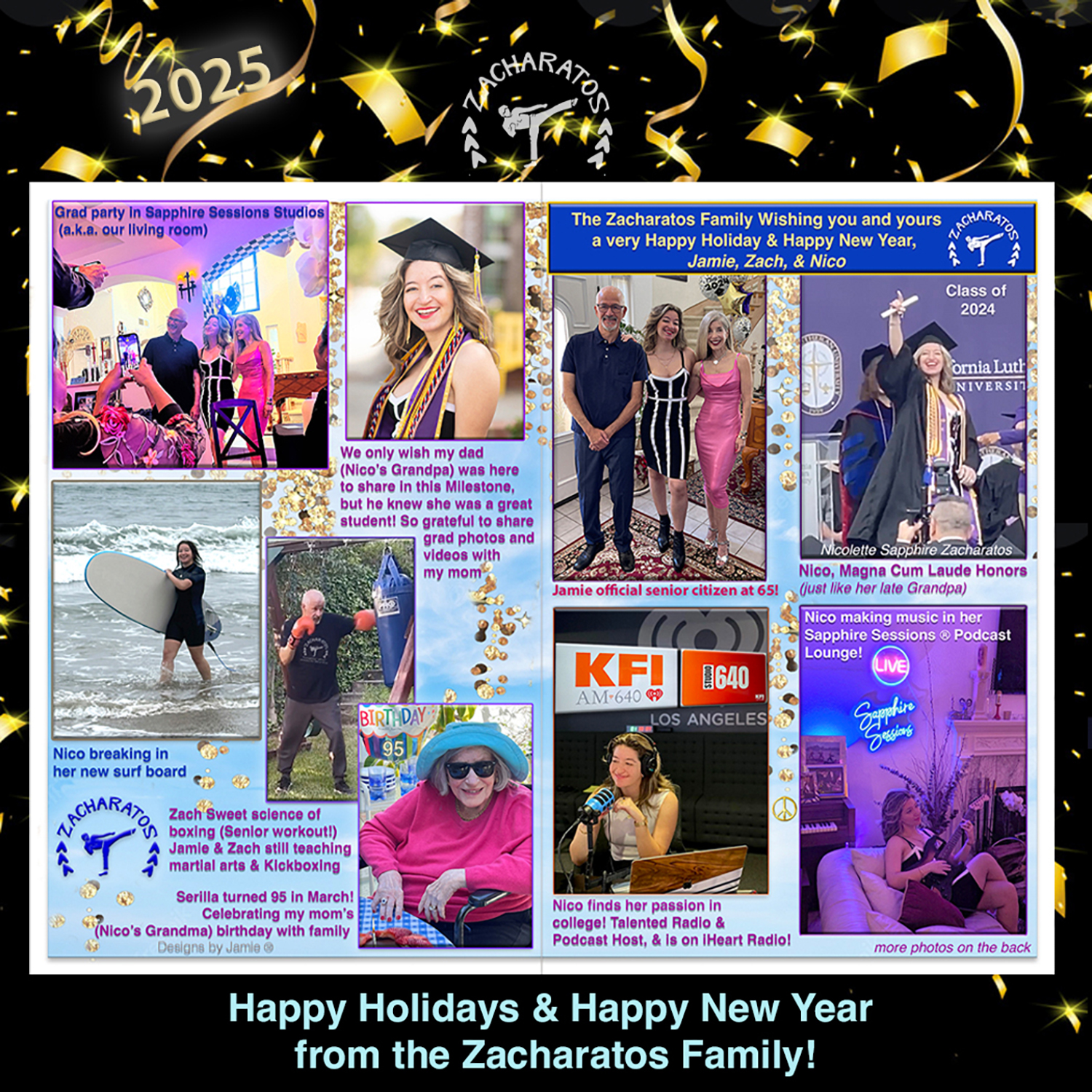
Our 2024-2025 holiday, yes another family montage! The main photoshopping I did on this card was to the photo of our daughter Nico Sapphire, who was on a radio show on iheart for several months. I added the logos from the show, KFI AM-640 Studio 640, in one of her favorite photos from when she was on air in their studio, and I used bevel emboss and perspective to the logos, it just worked!
I also had to photoshop my husband in our family group photo, since we took photos of each of us separately (a common occurence) for our daughter’s big college grad party after graduating with Magne Cum Laude honors in 2024! (extra special since her 2020 graduation was stolen by the pandemic) Another little photoshop trick I often use, my husband wasn’t wearing our logo t-shirt I had designed for our Martial arts studio when he was working out, so I had to photoshop that in on his shirt. To make the logo look more realistic and not pasted on, I lower the opacity of the image. I also updated the streamers on the background to fit the square size post needed for IG.
I make and send over 200 cards each year, and just when I think I’ll slow it down, so many friends and clients say they save all of my cards each year, so I continue to make them. I also save cards for years holiday cards with photos that I receive from friends and family, it’s wonderful to stay in touch and get updated on old and newer friends and clients.